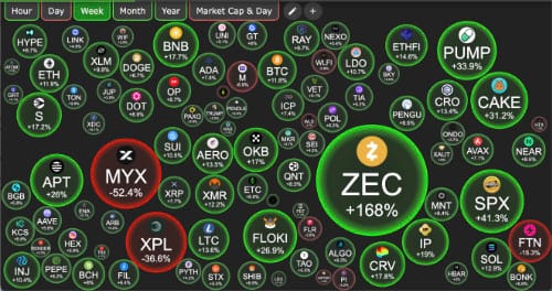
If there’s one thing as volatile as crypto price charts, it’s the challenge of making sense of crypto data. Raw numbers, candlestick graphs, order books — these can overwhelm. That’s where clever visualizations of numbers and patterns step in: they translate complexity into clarity, reveal hidden patterns, and invite exploration. One standout in this space is CryptoBubbles.net, which turns the crypto market into a dynamic bubble chart you can navigate. In this post, I want to explore the current state of the art in data visualization (with an eye toward crypto), and dive into what makes CryptoBubbles an intriguing tool for crypto investors and analysts.
The Landscape of Modern Data Visualization
Why visualization matters
- Humans are pattern-seeking animals. Data visualizations let us see structure — clusters, outliers, trends — that would otherwise hide in rows of numbers.
- Cryptomarkets are high-dimensional: price, volume, volatility, correlation, on-chain metrics, sentiment. Visual tools help us navigate many dimensions at once.
- In fast-moving domains like crypto, interactivity is key — static charts often lag the story.
Some current trends & techniques
Here are a few of the visualization trends shaping how we view complex data today:
- Grammar-of-graphics tools: Frameworks like Vega / Vega-Lite let developers specify visualizations declaratively and support interactivity. (They help separate design from data plumbing.)
- Scalable visualization for large datasets: Techniques like progressive rendering, level-of-detail, tiling/streaming, and aggregation help with thousands/millions of points.
- Multivariate, multi-attribute views: Rather than just plotting price over time, many visual systems layer or juxtapose multiple metrics (volume, volatility, network activity).
- Hybrid visual–analytics and visual reasoning: Interactive dashboards with linked views, filtering, drill-downs, and back-end querying.
- Blockchain-specific visualization tools: Because blockchain data has structure (blocks, transactions, flows), dedicated tools map that structure into intuitive visuals (graph layouts, flow charts, ledgers).
- Emerging research: invertible visualizations & adaptive encoding: Projects like InvVis embed data into visualizations so that you can reverse them; others propose models that suggest optimal visual encodings.
Challenges & tradeoffs
- Perceptual limits: Humans can only process so many colors, shapes, sizes effectively. Too many variables can confuse.
- Stability vs. reactivity: In live data, updating visuals must balance freshness with layout stability to avoid disorienting users.
- Scalability and performance: Rendering many interactive elements smoothly — especially on mobile — is technically challenging.
- Context & interpretability: Visuals need legends, guides, tooltips, explanations. Without that, interaction becomes confusing.
- Data integrity, latency & correctness: In financial/crypto domains, small data issues can mislead; the backend pipeline must be robust.
CryptoBubbles.net — A Closer Look
What is CryptoBubbles.net?
CryptoBubbles (also called Crypto Bubbles) is an interactive, web-based platform that visualizes the top ~1,000 cryptocurrencies using a bubble chart interface. Each bubble represents one coin or token; attributes such as size, color, and position encode metrics like market capitalization, price change, volume, etc.
It also has mobile apps (Android and iOS) so users can take it on the go. It brands itself as an “independent visualization tool and data aggregator,” free to use and ad-free.
Limitations, tradeoffs, and things to watch
- Dimensional saturation: Bubble charts are intuitive but can’t encode unlimited variables cleanly.
- Overplotting & clutter: Showing ~1,000 bubbles can lead to overlap or tiny bubbles in dense clusters.
- Perceptual distortion: Human perception of area is nonlinear; bubble size differences aren’t judged as precisely as bar lengths.
- Temporal movement and instability: Frequent repositioning or rescaling may disorient users.
- Data freshness & source reliability: The value depends on reliable, low-latency data pipelines.
- Analytical depth: CryptoBubbles is a visual “overview” tool, not a full-blown analytics engine.
- Competitive alternatives & reach: It competes with major crypto dashboards (CoinGecko, The Block, etc.).
Use cases & what it’s good for
- Quick market overview: spot which coins are surging/fading.
- Discovery/screening: find under-the-radar coins showing momentum.
- Portfolio tracking: mark and monitor favorites.
- Visual storytelling: embed bubble visuals in reports or blogs.
- On-the-go scanning: mobile app helps monitor trends outside the desk.
Position in the visualization ecosystem
CryptoBubbles is a “gateway” viz: a visually intuitive layer that invites you in, rather than a deep analytical end-state. It demonstrates how good visual affordances can engage users while keeping complexity manageable.
Potential enhancements and future directions
- Hybrid linked views: Pair a bubble view with time-series, correlation, network graph views, all linked by interactions.
- Temporal animation / “bubble race” view: Animate bubble trajectories over months/years, with careful layout stability.
- Embedding on-chain / sentiment data: Let users morph between price view, transaction view, social sentiment view.
- Predictive / alert overlays: Flag bubbles with alerts (e.g., volume spikes, news), integrate simple ML models.
- Better layout algorithms & stability: Use advanced bubble-packing and spatial embedding to cluster relationally meaningful groups.
- Invertible / embed metadata: Use techniques like InvVis so visuals carry hidden metadata for extraction or sharing.
- Visualization SDK / embedding: Provide embeddable components or APIs so others can incorporate CryptoBubbles into their own apps or sites.
Data visualization in the crypto world is not just about making charts — it’s about turning noisy, high-dimensional data into something our eyes and minds can explore. The best visualizations live in a balance: expressive enough to hint at complexity, yet simple enough to grasp instantly.
CryptoBubbles.net is a vivid example of that balance in practice. It gives you a dynamic, intuitive visual map of the crypto market — a visual “big picture” you can scan, probe, and react to. It doesn’t supplant deeper analytics, but it’s a powerful complement to them.
If you’re exploring crypto, or you teach/present crypto trends, or just like interesting data visualization, I recommend checking out CryptoBubbles.net

